
Would you like to save a few hours? We have mapped out the step-by-step process and components of the brand new Corporate Impact Analysis Tool. It was published by the United Nations Environment Programme Finance Initiative (UNEP FI) in March 2020.
As the original tool consists of 10+ Excel worksheets and literally thousands of rows and columns, we decided to create a step-by-step diagram-based user manual for everybody to use. After all, we do love the power of mind maps and other visualisations of complex issues. Thus we also enjoyed creating diagrams of this very useful yet rather complex tool.
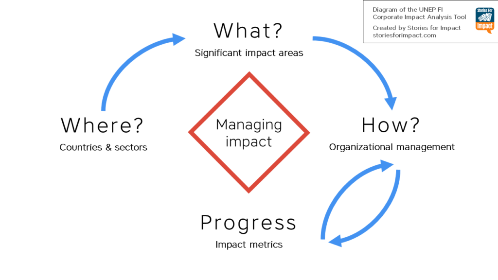
While the tool may be used by corporates as a contribution to strategic planning and business development, it is mainly intended to help banks and investors gain a cross-cutting view of their clients and investee companies, providing a bottom-up analysis company by company. The tool helps to tackle the questions of “Where?”, “What?” and “How?” while enabling to monitor the progress towards the targets of creating positive impact and reducing any harmful consequences as a result of the business activities.
PART 1 of the tool
Identification of significant impact areas based on company typology, geography and sectors of activity
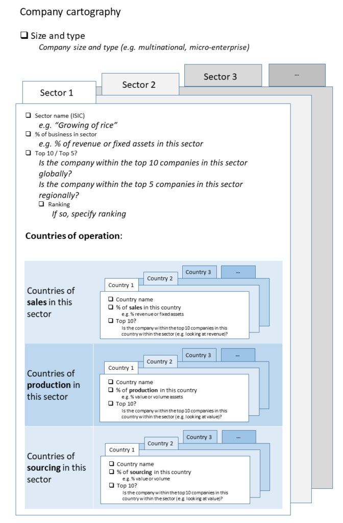
Company cartography
In this section you will answer questions about the sectors and the countries that your company is involved in. This is the “where” part of the tool. By knowing the sectors, this tool will (later) tell you which impact areas your company influences the most. By knowing the countries of operation and the company’s influence over them (by looking at the rankings), you can prioritize where to start improving your impact. For example, let’s say a majority of your revenue comes from France and that country has a high unemployment rate. If your company is able to create a significant amount of jobs in France, that should be your top priority.
The names of the sectors in which your business operates has to be chosen from the predefined list of sectors according to the International Standard Industrial Classification (ISIC). The list is included in the tool. Up to 15 sectors can be added.
The structure and questions of this section can be seen in more detail on Figure 1.
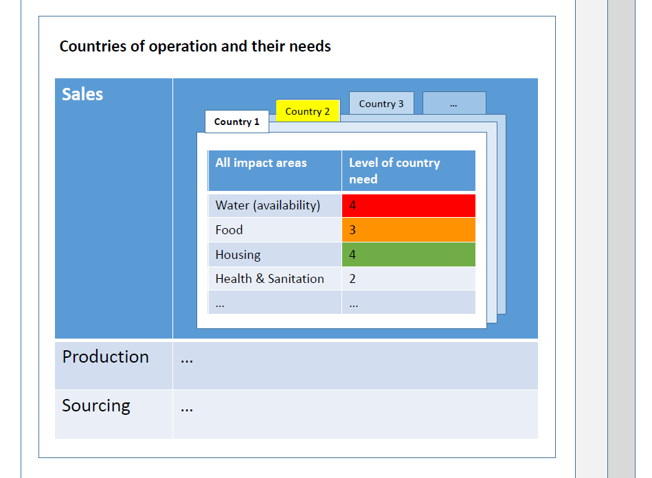
Country needs
In this section you will find out the needs of each country of operation across 22 impact areas.
Impact areas are the “themes” of the impacts, under the three pillars of sustainable development (economic, environmental, social). These can be “water availability”, “education”, “justice” and so on. The impact areas used in this tool are based on the PI Impact Radar. You will need to input the scores for each impact area and for each country of operation (Figure 2).
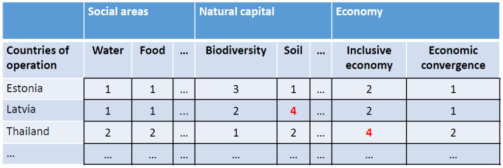
The workflow in this section goes like this. You choose a country the company is involved with. You check if the country needs are already filled out in this tool. If not, you will do it yourself by visiting a website (e.g. unstats.un.org), finding the appropriate statistic and inputting the appropriate score in the tool. You will find a metric about the country (for example undernourishment) and you go back to the tool. In the tool, there is a scoring system for each impact area.
For example, the score for “Food” for any country would be
“1” if undernourishment under 5%
“2” if it is between 5 – 14.9%
“3” if it is between 15 – 24.9% and
“4” if it is more than 25%.
For example, if you find out that undernourishment in the chosen country is less than 5%, you put “1” in the corresponding cell of the table.
Profile – Sector 1 … 15
Here you can see information for all the sectors that were previously selected.
Everything in this section is generated automatically. You can think of it as an overview or a dashboard that you can use to select “the most significant impact areas” later on. Information here is assembled from the previous two sections.
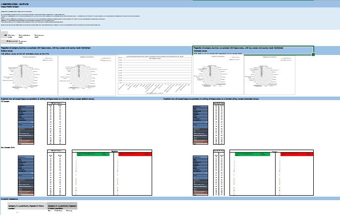
The main part of this section presents the impact area associations (Figure 3).
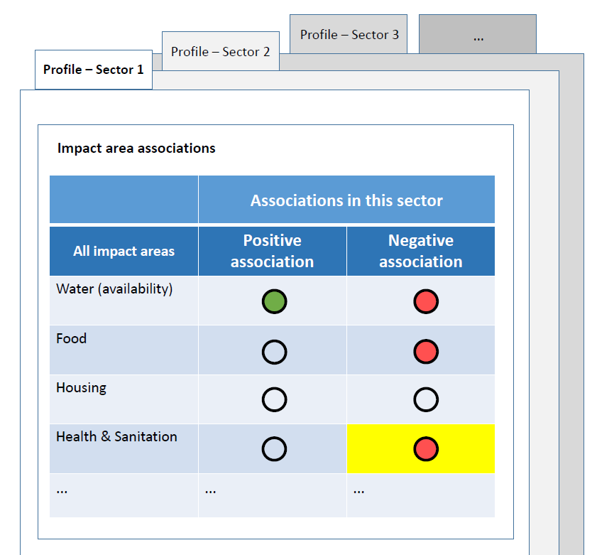
These “traffic lights” visualize the positive (green) and negative (red) associations for each sector and for each impact area. The idea behind these associations is that each sector has some positive and some negative impacts. For example, organic food production contributes positively to food accessibility, but negatively to water availability. These associations are included inside the tool and appear automatically. Data is gathered from generally trusted sources, including IFC’s EHS Guidelines and UNEP FI’s Risk Briefings.
If a sector has an especially significant effect on an impact area, it is considered a key sector for that impact area.
All of these associations, including key sectors, can be manually changed.
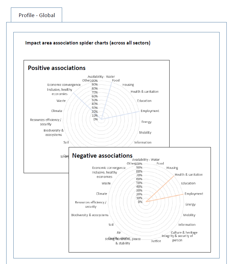
The spider charts on Figure 4 also visualize these associations.
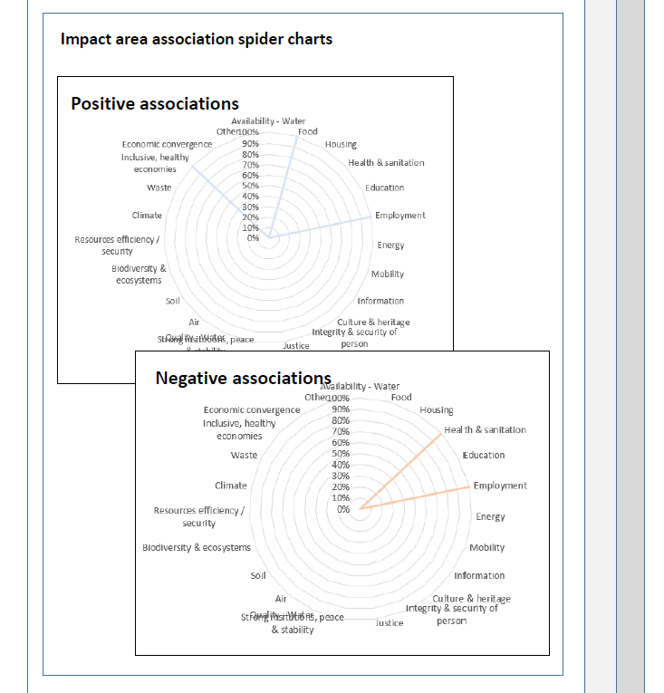
A line going towards an impact area indicates an association.
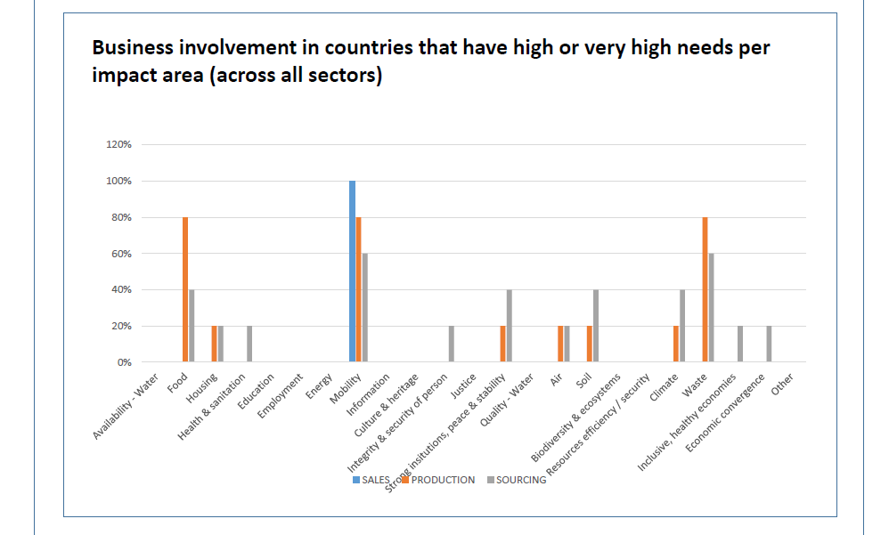
The chart on Figure 5 demonstrates the country needs that your company is involved with. This is useful because the more serious any specific need is, the higher it should be on your priority list of positive impact creation.
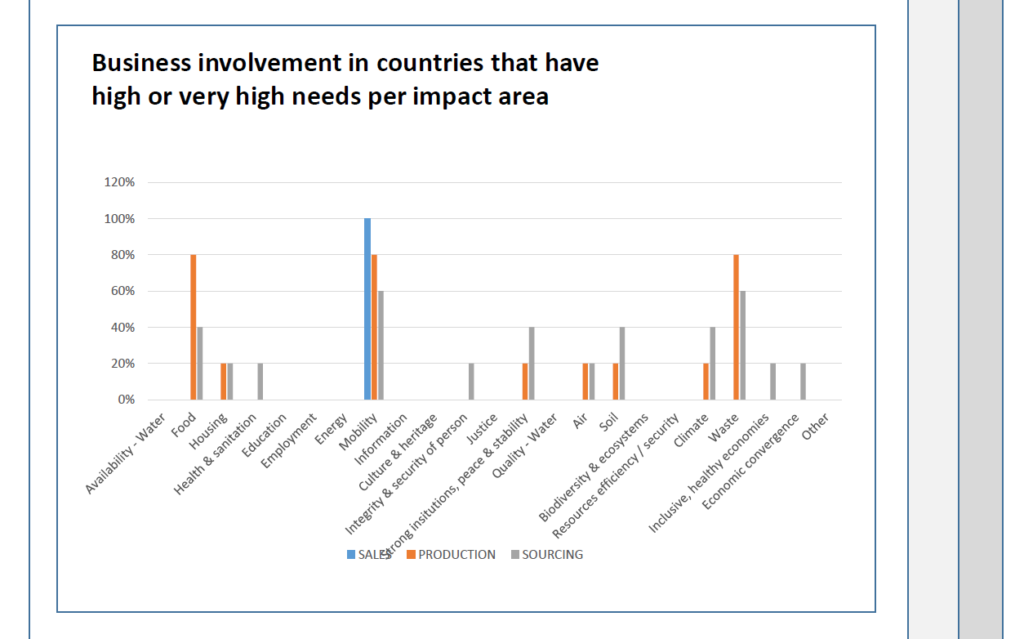
On the x-axis of the chart there are impact areas. On the y-axis is the percentage of business which is involved with countries that have a high or very high (score 3 or 4) need in an impact area. There are three sets of bars on this chart: one for countries of sales, one for countries of production and one for countries of sourcing.
For example, if the company gets 80% of sales revenue from Botswana and the need for “Water (quality)” is very high in that country, the bar chart would have (at least) 80% in the “Water (quality)” column. If the only other country of sale is Nigeria and that too has a high need for good quality water, the bar chart would have 100% in the corresponding column.
On Figure 6 you can see which countries in particular have high needs in an impact area.
If a value is highlighted red – the country need is 3 or 4 and the impact association is negative and the current sector is a key sector for this impact area (i.e the sector influences the impact area significantly).
If a value is highlighted orange – the country need is 3 or 4, the impact associations are simultaneously negative and positive and the current sector is a key sector for this impact area.
If a value is highlighted green – the country need is 3 or 4, the impact association is positive and the current sector is a key sector for this impact area.
If a country is highlighted yellow – it is classified as a “least developed country” (LDC).
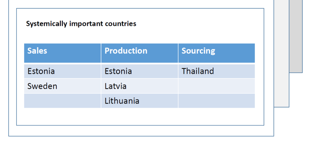
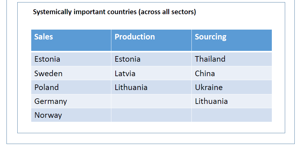
On Figure 7 you can see an example list of systemically important countries – that is, countries in which your company is in the top 10 ranking.
Profile – Global
Like in the last section, this is an overview of all previous information. Unlike the previous section, this contains information about the company as a whole – across all sectors. Thus, the impact associations are indicated in percentages (Figure 8, Figure 9).
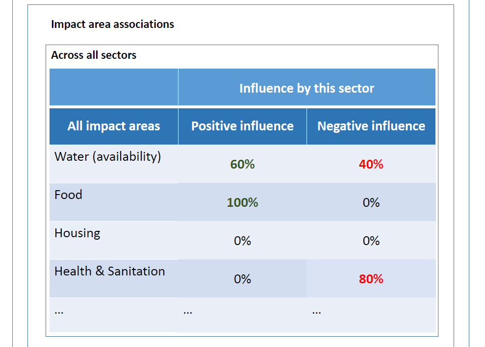
Here’s how to think about these percentage values. Let’s say your company gets 20% of revenue from growing rice and 30% from growing tobacco. Since both of those sectors contribute negatively to water availability, then this table would show 20% + 30% = 50% in the “Negative influence” column and “Water (availability)” row. However, if only rice contributes positively to food availability, you will see a 30% positive influence in the impact area “Food”.
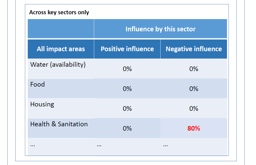
In Figure 10, only sectors which are key to a particular impact area are considered.
As in the last section, you can also see what are the needs of the countries of operation, this time across all sectors (Figure 11)
And you can see a complete list of systemically important countries, which are, like in the previous section, countries in which the company is in the top 10 rankings of a sector (Figure 12).
Most significant impact areas
You have arrived at the final section of Part 1: identifying the most significant impact areas (Figure 13). These impact areas will be a major focus in Part 2 and you will need to use all of the information gathered previously to select these impact areas.
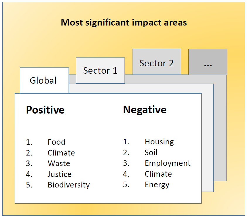
The most significant impact areas are selected using the following criteria:
- Impact areas with the highest levels of country needs should be prioritized.
- The needs of systemically important countries should be prioritized.
- Key sectors should be prioritized.
Once you have decided upon at least 5 most significant impact areas, both positive and negative, for each sector and across all of them, it is time to move on with part 2.
PART 2 of the tool
Assessment of the company’s impact performance and impact management capabilities
Impact performance
You have successfully identified the impact areas that your company has the most influence in. Now you will demonstrate the company’s actual impacts in those areas (Figure 14). The precise metrics need to be chosen by yourself. For example, you can use the IRIS catalog of metrics.
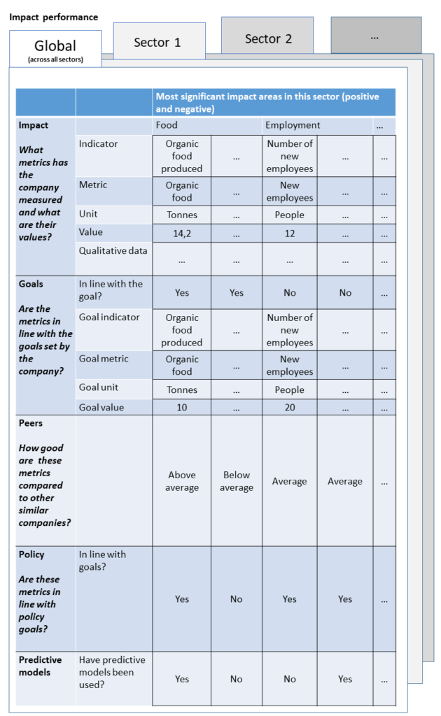
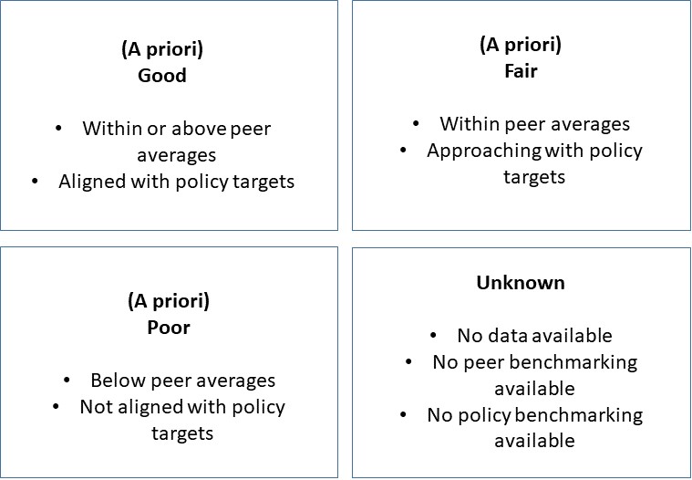
At the end of this section, you will choose one of seven performance statuses to indicate the level of those impacts so far (Figure 15). An “a priori” status is given if data (quantitative or qualitative) is available for only a limited number of indicators.
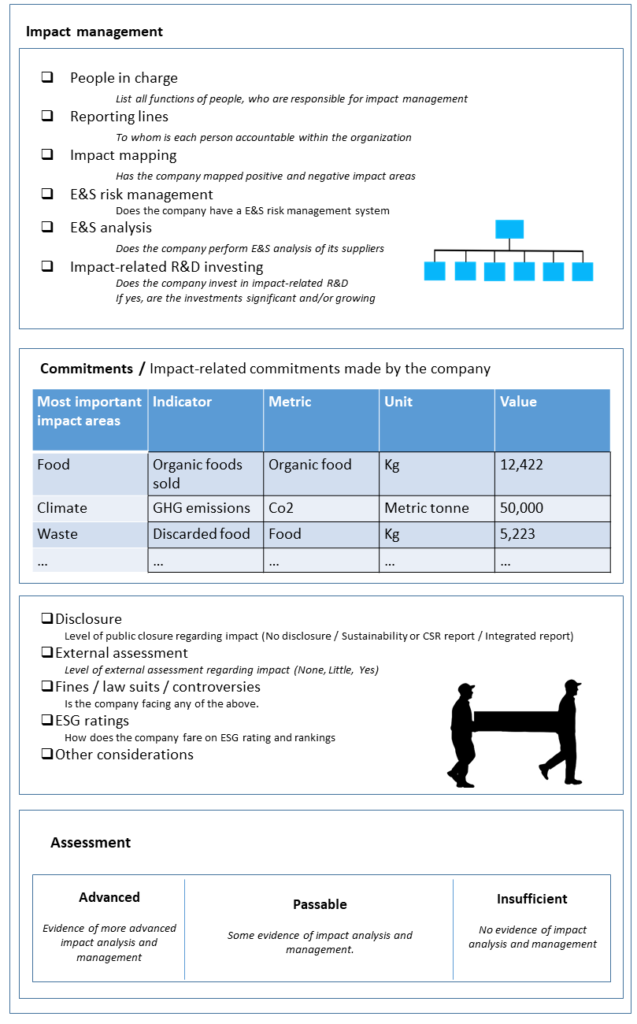
Impact management
The managing capabilities of the organization are important in assessing the impact as a whole. For example, f there are no people in charge to improve impacts then impacts will most likely not improve. In this section, you will need to answer questions about the impact management capabilities of your company and based on the answers, give your company one of three rankings: advanced, passable or insufficient. This section can be seen in more detail on Figure 16.
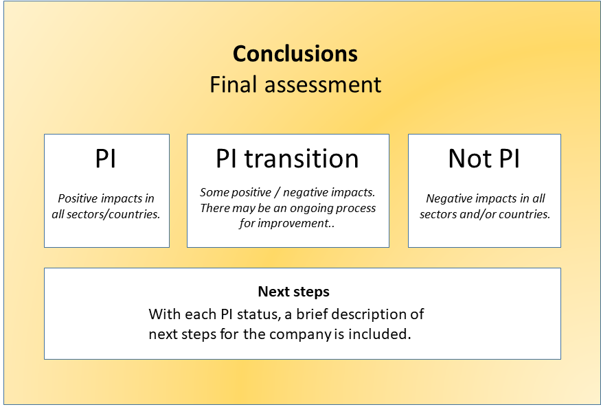
Conclusions
You have reached the very end of the tool. In this section, using everything you have learned about so far, you need to choose one of three final statuses for your company: PI, PI transition or Not PI (Figure 17). PI stands for “positive impact” in this case.
The criteria for achieving PI status are the following:
• No activities in any exclusion list sectors;
• >50% of revenue generated in low income countries;
• good impact performance;
•good impact management capabilities;
• >50% of revenue generated in sectors that fall under a recognized taxonomy (e.g. EU taxonomy).
You have reached the end of the process related to the Corporate Impact Analysis Tool.
If you need a top-down analysis of your portfolio instead, have a look at the the Portfolio Impact Analysis Tool for Banks. That tool helps banks to analyze the impacts associated with their retail (consumer and business banking) and wholesale (corporate and investment banking) portfolios. In fact, we have prepared a user manual of that tool too, just like this one! And here you can read our in-depth comparison of the tools as well as a review summing it all up.
Do you have a topic or challenge that you would like us to analyze and visualize? If so, please do get in touch with us via e-mail info@storiesforimpact.com or using our contact form.