
Would you like to save a few hours? We have mapped out the step-by-step process and components of the brand new Portfolio Impact Analysis Tool for Banks. It was published by the United Nations Environment Programme Finance Initiative (UNEP FI) in March 2020.
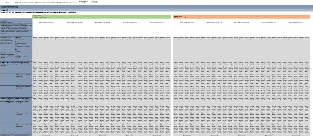
As the original tool consists of 10+ Excel worksheets and literally thousands of rows and columns (Figure 1), we decided to create a step-by-step diagram-based user manual for everybody to use. After all, we do love the power of mind maps and other visualisations of complex issues. Thus we also enjoyed creating diagrams of this potentially very useful yet rather complex tool.
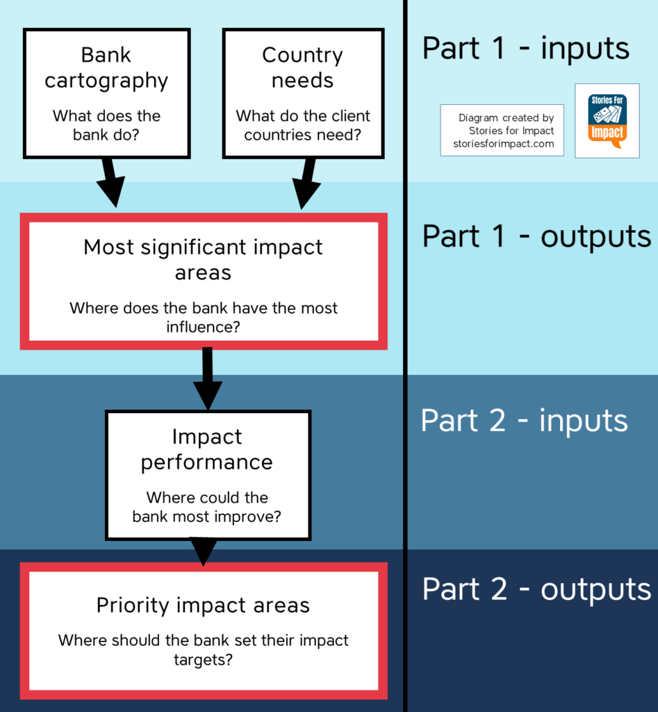
This tool is mainly intended to help banks gain a holistic view of their impact from all aspects: retail (consumer and business banking) and wholesale (corporate and investment banking). The main result from using this tool is a list of priority impact areas. Those are the areas, which the (1) bank has most influence in, (2) where the countries of operations have most societal needs and (3) where the bank has the poorest performance. The main process flow of the tool can be seen in Figure 2.
PART 1 of the tool
Identification of significant impact areas based on the bank’s typology, geography and sectors of activity
Bank cartography
In this section you will answer questions about the sectors and the countries that your bank is involved in. By knowing the sectors, this tool will (later) tell you which impact areas your bank influences the most. By knowing the countries of operation and the bank’s influence over them (by looking at the league tables), you can prioritize where to start improving your impact. For example, let’s say a majority of your activity is in France and that country has a high unemployment rate. If your bank is able to create a significant amount of jobs in France, that should be your top priority.
The structure and questions of this section can be seen in more detail on Figure 3.
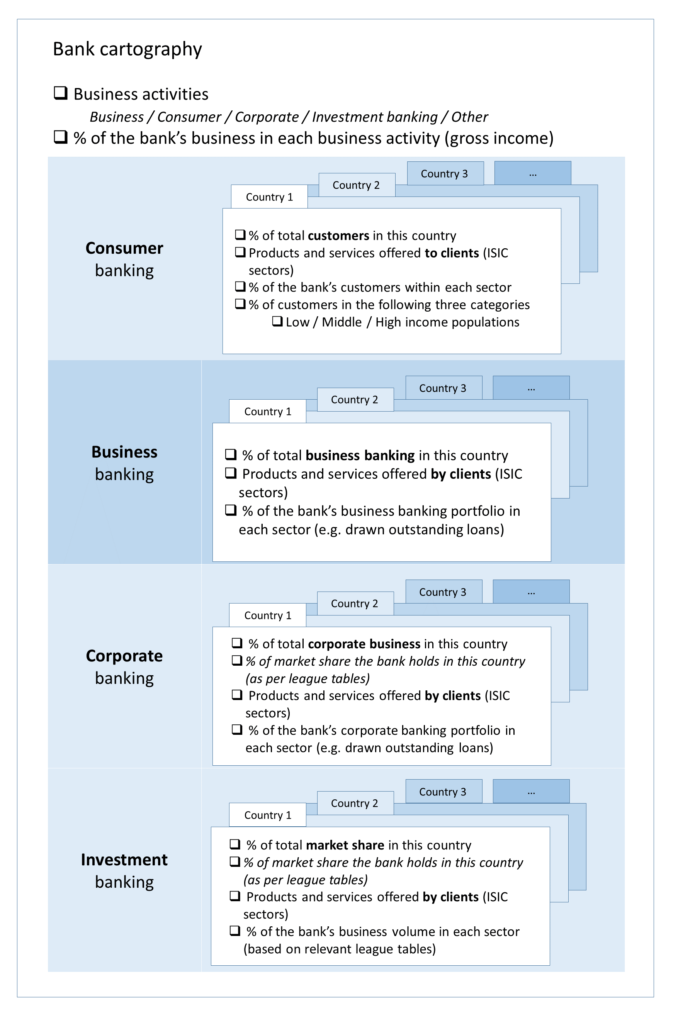
The names of the sectors in which your bank operates has to be chosen from the predefined list of sectors according to the International Standard Industrial Classification (ISIC). The list is included in the tool. Up to 15 sectors can be added.
More sectors and countries can be added anywhere if necessary.
Country needs
In this section you will find out the needs of each country of operation across 22 impact areas.
Impact areas are the “themes” of the impacts, under the three pillars of sustainable development (economic, environmental, social). These can be “water availability”, “education”, “justice” and so on. The impact areas used in this tool are based on the PI Impact Radar. You will need to input the scores for each impact area and for each country of operation (Figure 4).
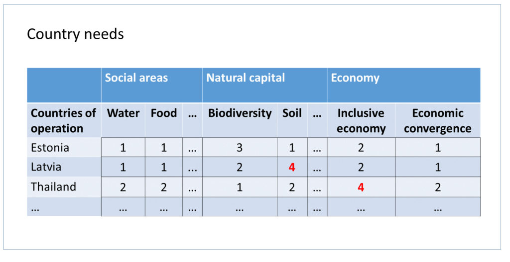
The workflow in this section goes like this. You choose a country the bank is involved with. You check if the country needs are already filled out in this tool. If not, you will do it yourself by visiting a website (e.g., of the United Nations Statistics Division), finding the appropriate statistic and inputting the appropriate score in the tool. You will find a metric about the country (for example undernourishment) and you go back to the tool. In the tool, there is a scoring system for each impact area.
For example, the score for “Food” for any country would be
“1” if undernourishment under 5%
“2” if it is between 5 – 14.9%
“3” if it is between 15 – 24.9% and
“4” if it is more than 25%.
For example, if you find out that undernourishment in the chosen country is less than 5%, you put “1” in the corresponding cell of the table.
Profile – Consumer, Business, Corporate and Investment Banking (Global)
In this section, you don’t have to input anything. Here you can see an automatically generated view of your impact. Based on your sectors of operation, this view shows you which impact areas you affect the most.
This information is shown across all countries (global) and for each country individually.
Depending on the type of banking, there are slight differences in the content here.
- In the consumer banking profile you can see impact associations related to having low, middle or high income clients.
- In the business banking profile you can see whether the types of businesses contribute to inclusive, healthy economies.
- In the corporate banking profile you can see impact associations related to their position in league tables.
The first part of this overview is a spider chart showing which impact areas you affect the most (Figure 5).
The spider charts visualize the positive and negative impact associations for every impact area.
- A blue line going towards an impact area indicates a positive association,
- orange indicates negative,
- yellow represents the impact on economic convergence based on the bank’s operation in the least developed countries (LDCs).
Next you can see a detailed table showing again your impact. This time you can see it for each country individually as well (Figure 6).
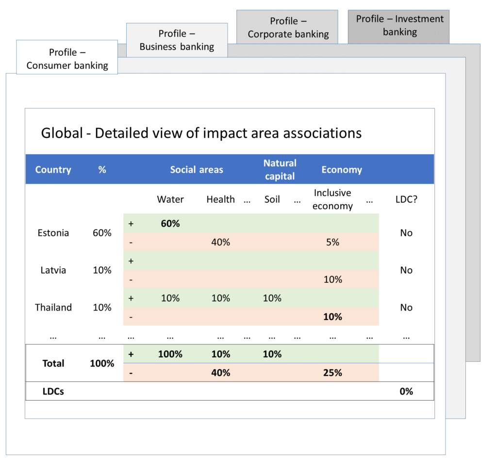
The percentages next to each country indicate how much of the bank’s total activities are in that country. The percentages under each impact area indicate how much of the bank’s impact come from that country.
For example if 100% of the investments in Norway go towards growing wheat and Norway accounts for 10% of total investments then Food would have 10% positive influence and Soil 10% negative influence.
But where do these percentages actually come from? How does this tool know what my impact is? That’s a great question.
First, if should be obvious that each sector affects some impact areas positively or negatively.
For example, organic food production contributes positively to food accessibility, but negatively to water availability.
These associations between sectors and impact areas are included inside the tool and shown in with these graphs and tables! This information comes from trusted sources, including IFC’s EHS Guidelines ja UNEP FI’s Risk Briefings.
If a sector has an especially significant effect on an impact area, it is considered a key sector for that impact area. The associations in bold reflect key sectors.
And that’s how it works!
Note! In consumer banking, you are measuring the impact of the products and services that you (the bank) are offering. In other types of banking, you are measuring the impact of the activities, including investments of your clients.
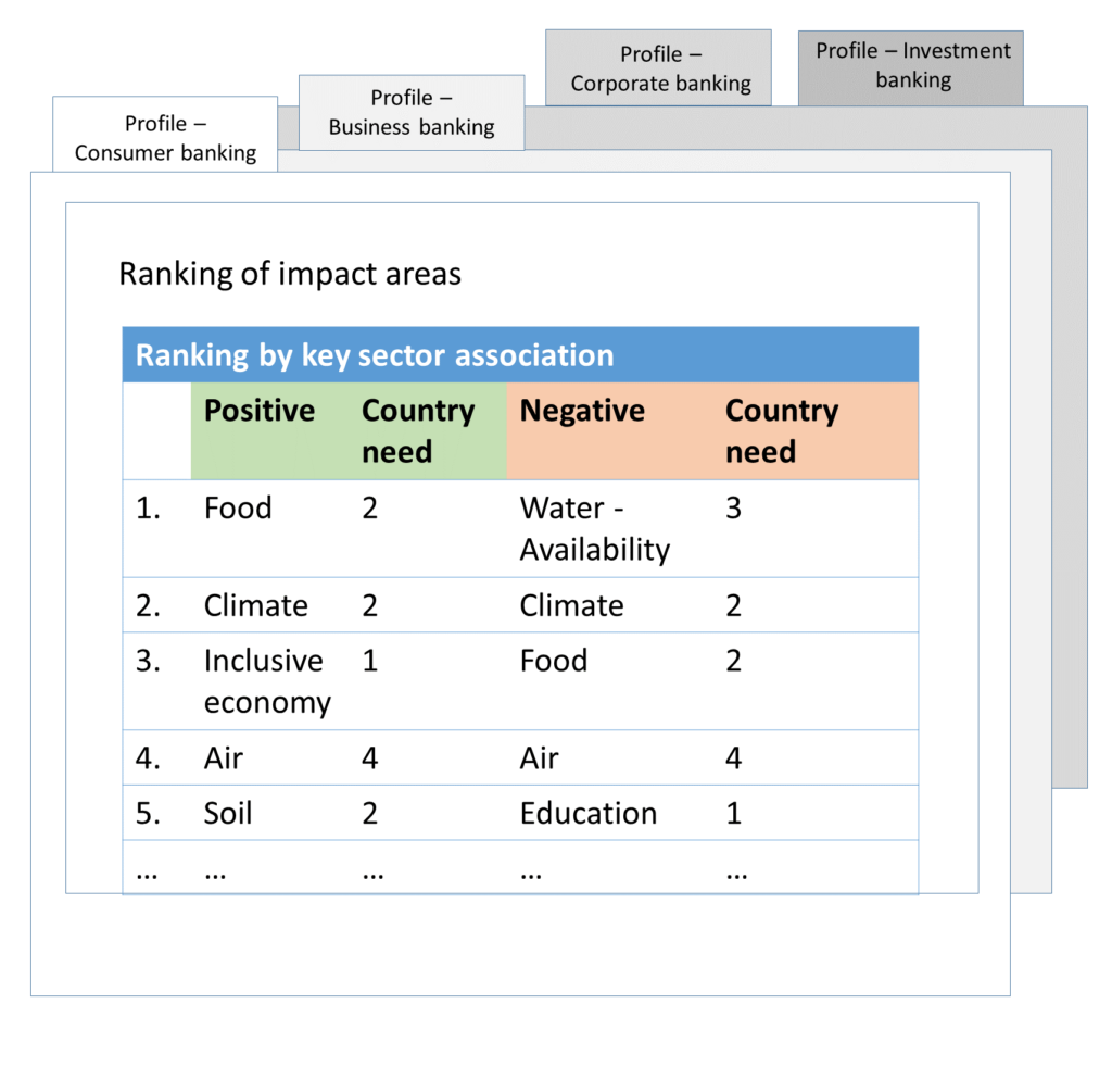
Next, you can see a list of impact areas, ranked by how much your bank affects them and by how much your countries of operation are lacking these areas (Figure 7).
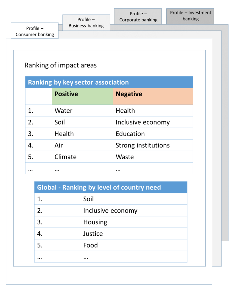
The first ranking depends on the bank’s or clients’ involvement in sectors which are strongly associated with an impact area (i.e. are the key sectors).
For example if the most significant sector for clients in Poland is growing wheat, and the bank operates mostly in Poland, a positive association for “Food” would be high in the rankings.
The second ranking depends on the frequency of the country needs.
For example if the bank operates in France, Canada and Germany and all of those countries have a high need for an efficient use of waste, the impact area “Waste” would have a frequency of “3” and be ranked accordingly.
Profile – Consumer, Business, Corporate and Investment Banking (For each country)
All of the information listed in the previous section is also available for each country separately.
You can see charts of impact area associations (Figure 8).
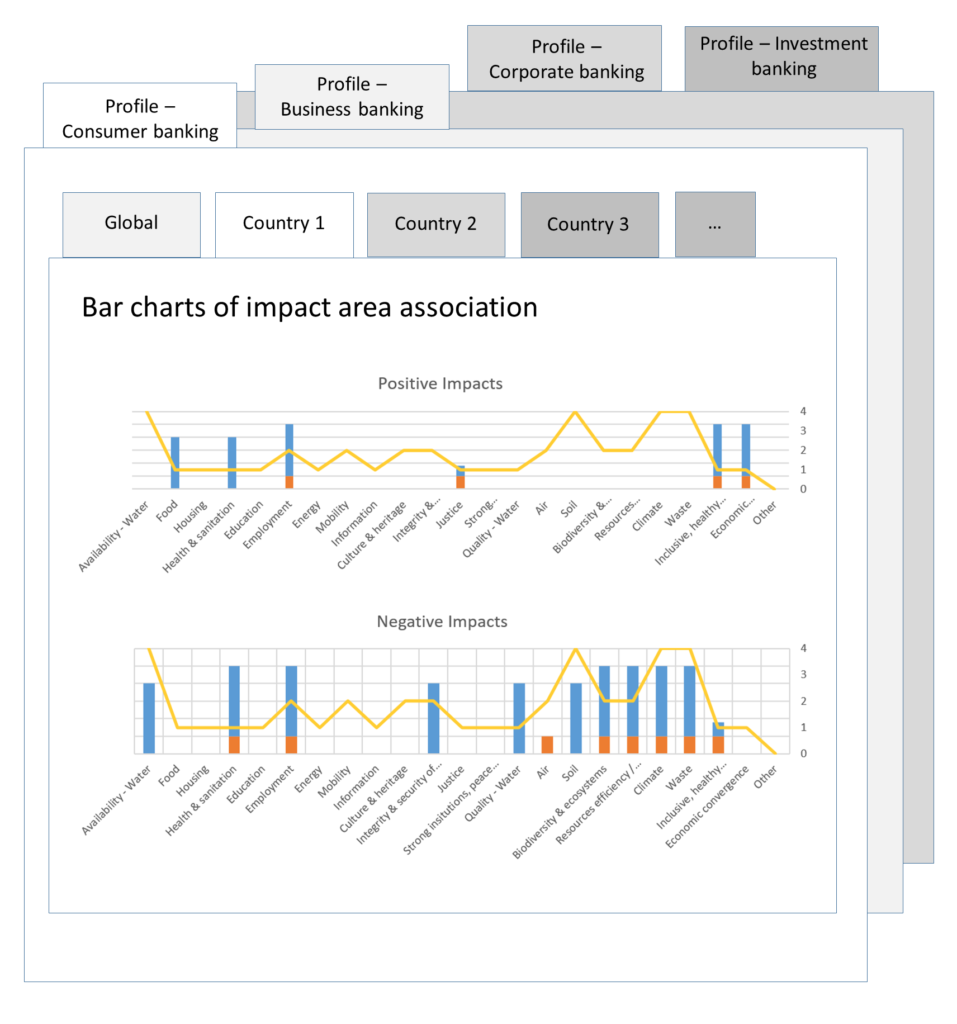
This bar chart shows which impact areas are affected by the bank’s activities. This is based on the sectors, types of clients and the bank’s involvement with both.
The different colors on bars indicate different ISIC business sectors.
For example, blue may be “6444 Consumer credit and overdraft” and orange may represent sector “6511 Life insurance”.
The yellow line shows the needs of the country.
This bar chart is particularly useful when choosing the most significant impact areas based on influence and country needs later.
Just like the global view, this detailed view shows the impact associations in more detail (Figure 9).
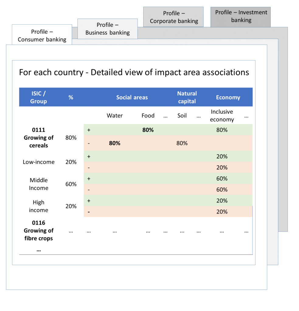
Just like the global view, this detailed view shows the impact associations in more detail.
The percentages right of each ISIC sector indicate the percentage of bank’s activity in that sector.
For each impact area, that every sector influences, that percentage of bank’s activity is also shown under that impact area.
If a sector is a key sector for an impact area, the percentages are shown in bold.
For consumer banking, each sector is divided into three categories of clients: low, middle and high income. The percentages behind each client category indicate the proportion of clients in that business sector. Each client category has specific impact areas it influences (unrelated to the impact areas that the sector influences). These associations are also shown in this view.
Next, just like the global view, there is an impact area ranking (Figure 10).
This ranking depends on the bank’s or clients’ involvement in sectors which are strongly associated with an impact area (i.e. are the key sectors).
For example if the most significant sector for clients in Poland is growing wheat, and the bank operates mostly in Poland, a positive association for “Food” would be high in the rankings.
Most significant impact areas
At the end of Part 1 of this tool, you can select yourself the initial ranking of impact areas (Figure 11).
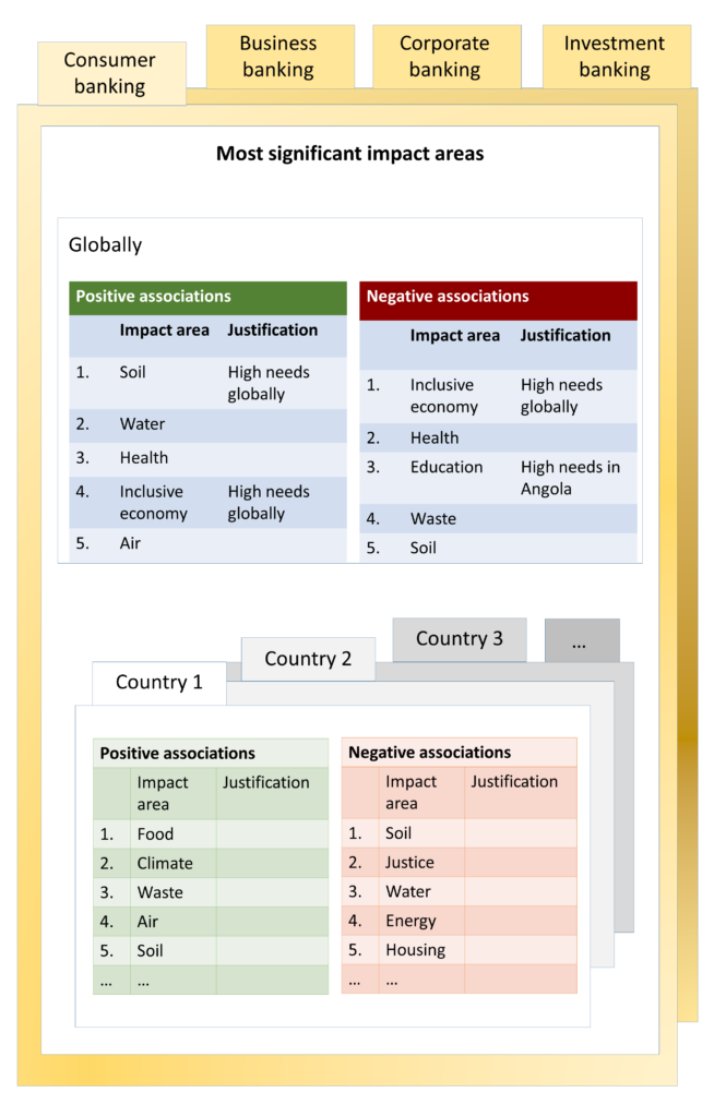
This brings together the information from all of the previous steps.
The impact areas should be chosen by taking into account that:
- The impact areas with the highest levels of country needs should be prioritized.
- The impact areas associated with sectors and countries where the bank is a market leader should be prioritized.
Note: this ranking is based on the bank’s own judgement.
PART 2 of the tool
Assessment of the bank’s impact performance
Impact performance
In this section you will answer questions about the bank’s impact performance thus far for the most significant impact areas chosen in the previous section (Figure 12). This is done to find impact areas, which have the worst performance right now – these should have the highest priority in the future.
In this section, sectors and questions appear automatically. Everything else has to be added manually (including all indicators, metrics and values).
The impact areas here appear automatically based on what were selected earlier as the most significant impact areas.
After you have answered all the questions, you manually select a performance status from a list of possible statuses (Figure 13).
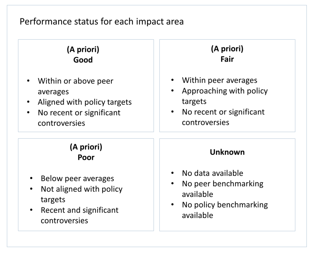
An “a priori” status is given if data (quantitative or qualitative) is available for only a limited number of indicators.
Priority impact areas
Here you have to make the final decision – which impact areas does the bank affect most significantly (Figure 14).
Remember everything you have learned so far. It all comes together here. The bank’s sectors, countries of operation, impact associations and performance status.
When setting priorities, take into account the following:
- Most significant impact areas should be prioritized (this means impact areas with high country needs and high influence from the bank’s activities).
- Impact areas, where performance is poor should be prioritized.
According to the tool, the next steps for the bank should be the following:
- Review which key sectors and countries turn up in these conclusions.
- Identify main clients and business activities in these sectors and countries.
- Consider excluding activities which bring negative impact and increasing engagement with others.
- Consider setting targets for growth in business segments with (1) clear positive associations, (2) where the country needs are high (3) and where the current performance is poor.
And that’s it! You have reached the end of the process related to the Portfolio Impact Analysis Tool.
If you need a bottom-up analysis of your clients and investee companies, company by company, look at the Corporate Impact Analysis Tool instead. In fact, we have prepared a user manual of that tool too, just like this one! And here you can read our in-depth comparison of the tools as well as a review summing it all up.
Do you have a topic or challenge that you would like us to analyze and visualize? If so, please do get in touch with us via e-mail info@storiesforimpact.com or using our contact form.