
How to create a new visual language that articulates what the organization´s contribution to the world is about? We wanted the main visual of Stories For Impact to express our core identity in a straightforward manner – no symbols or visual metaphors or overused “Scandinavian design”. What we also wanted was to capture the sense of creativity and intellectual fun that forms the core part of our DNA.
One of the best ways to spark creativity and thus innovation is combining the opposites – water and fire, darkness and light, energy and calm.
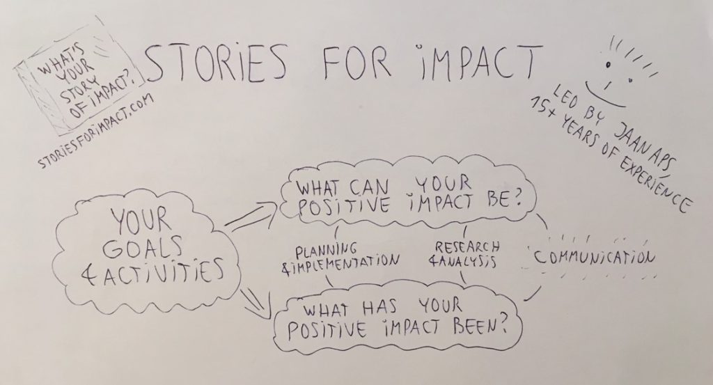
What we first did was to draw a mind map to express mostly verbally professional key words that our services are about. As you can see from the picture, it conveyed a very simple and clear message, so unambiguous it borders on lack of imagination.
And what next? What could represent a creative opposite of carefully selected and positioned corporate keywords? Well, for example, hiring a design student whose portfolio mostly consists of colorful and energetic depictions seemingly straight out of Japanese mangas and American comic strips. We felt that combining his talents with our simplistic sketch would create conditions for creativity and innovation that we were looking for.
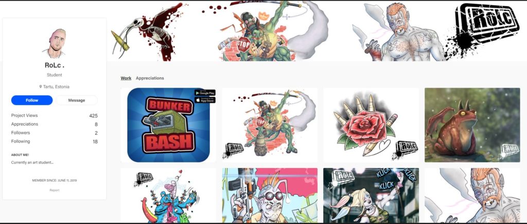
And the rest is history or in fact the present as the designer whose name is Ronald managed to create a design that we loved. He kept our corporate key words while spicing the visual image of Stories For Impact up with some creative energy, tactfully avoiding turning it into a violent comic strip 🙂 Alongside, Ronald created our new logo and chose accompanying colours.
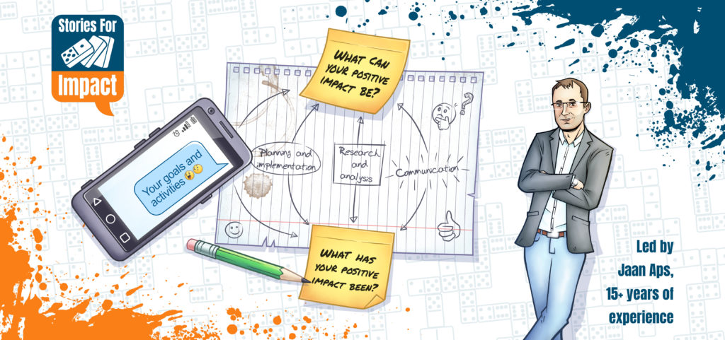
In conclusion – combining the opposites had its intended impact, giving birth to a playfully unique approach to corporate design. We heartily recommend its creator Ronald Must – you can check out his portfolio at this link.